Late Night Development Sessions
Part 1 of a several part series on redesigning a website
Earlier this evening (the night of the 29th of January) I decided to try and tackle another project. Now I know that in this post I said that I wanted to try and focus only on one project at a time and try to finish a project in 30 days. However my random ideas got the better of me so I now have a running total of maybe 5 or 6 projects most of which I started this year.
However recently I have been wanting to both (1) develop and showcase some design skills and (2) redesign a website that I have been using for the past three years at school. 1 So When I realized that I had some free time with no homework to do (yet) this weekend, I figured why not redesign this website.
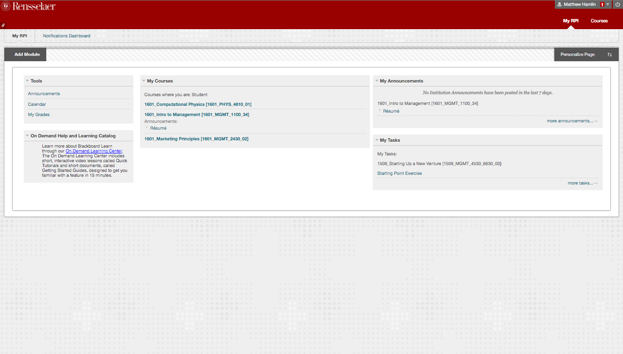
The website that I have been talking about is known as LMS on campus, because it is a Blackboard Learning Management System that RPI licenses from blackboard. The version of LMS that we are using here at RPI is fairly different from the mockups that are shown in that blackboard website above, in face here is a screen grab of what the website looks like for me for this semester:

When I decided to redesign the website I started with the basic functionality, so first and foremost (what the meat of this blog post will be about) I focused on the index/home page. The page that users (students) will be introduced to when they login successfully.
For this redesign, I focused on the core content that a student will want to see when logging into the website. Notifications also known as Announcements, Grades, and then course content. These three pieces of information are key to most students who currently use the LMS system we already have. 2 So the first page that users are presented is the announcements from all the courses that they are taking that semester and a quick look at the grades for their recently graded assignments, exams, and labs.
For the grading section I used small accents of color to show how the grade was, so if an assignment received an A, then I would color it green to show that it is a good grade, however if the assignment received a D or an F I would color those red and offer a link to bring up more information regarding the grade.
So far I haven’t done much else besides a few small interactions built into the site, if you want to see the live demo of the site you can see it at goexploring.today.
I expect to do the login and signup pages tomorrow (as well as some homework) and then I will writeup some of the design decisions I made for those pages.